"The picture-examining eye is the best finder we have of the wholly unanticipated"
(John Tukey, 1915 - 2000)
Back in 1992 I participated in a panel discussion at the Australasian Meetings of the Econometric Society, in Melbourne. I don't recall what the topic was for the panel discussion, but I do recall that my brief was to talk about some aspects of "best practice" in teaching econometrics. In case you weren't there, if you slept through my talk, or if you simply hadn't yet learned how to spell "econometrics" back in 1992, I thought I'd share some related pearls of wisdom with you.
One of the main points that I made in that panel discussion could be summarized as: "Plot it or Perish". In other words, if you don't graph your data before undertaking any econometric analysis, then you're running the risk of a major catastrophe. There's nothing new in this message, of course - it's been trumpeted by many eminent statisticians in the past. However, I went further and made a scandalous (but serious) suggestion.
My proposal was that no econometrics computer package should allow you to see any regression results until you'd viewed some suitable data-plots. So, if you were using your favourite package, and issued a generic command along the lines: OLS Y C X, then a scatter-plot of Y against X would appear on your computer screen. You'd be given an option to see other plots (such as log(Y) against log(X), and so on). In the case of a multiple regression model, a command of the form: OLS Y C X1 X2 X3, would result in several partial plots of Y against each of the regressors, etc.. Then, after a prescribed time delay you would eventually see the message:
"Are you abolutely sure that you want to fit this regression model?"
A positive response to this question would finally reveal the usual regression statistics and diagnostics.
Now, you might think that all of this would just slow you down in your quest for regression results. Frankly, I hope you're right! In my view we'd do a far better job if we spent more time thinking about our models and our data than we generally do. John Tukey's emphasis on the importance of Exploratory Data Analysis , as opposed to "confirmatory data analysis", is something that is just as important today as it was in the 1970's. It's also worth emphasizing that graphing data- especially high-dimensional data - in revealing ways is definitely an art as much as a science. If you're not already familiar with Edward Tufte's important contributions, then I definitely recommend his wonderful books, The Visual Display of Quantitative Information
 and Envisioning Information.
As a prop in my contribution to the panel discussion I used a data-set and associated graphic that I've since found to be quite useful in many of the econometrics courses that I've taught. The graphic is on my professional web page, but I'm reproducing it here for you:
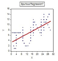
Gives the term "spurious regression" a whole new meaning, doesn't it? To see how the graph was generated, and to check out the associated regression results, you can download an EViews file from the Code page that goes with this blog. In particular, take a look at the 'Read Me' text object inside the EViews file to get an idea of how you might use this material in an econometrics tutorial or lab. class. I tend to use it in two ways - first to make the point about plotting your data before you estimate a regression model; and second, to emphasize why the R2 associated with a fitted model is just about the last thing that I ever look at. Here, we have cross-section data, so the reported R2 of 0.491 is actually pretty respectable. In addition, the t-statistics for the estimated slope and intercept coefficients are7.9 and 5.4 respectively. On the face of it, we might be pretty happy with our fitted regression - at least, until we plot the data! I typically get students to estimate the OLS regression and then plot the data afterwards. People usually get the point!
I'm not sure that we really push this message hard enough in our introductory econometrics courses.The statisticians do better in this respect, and perhaps the most well-known example is "Anscombe's quartet" - a group of four very interesting data-sets produced by Anscombe (1973). The interesting thing about the four pairs of X and Y data is that they have identical summary statistics and the fitted OLS regression line is identical in each case. However, visually the data are dramatically different. The data and graphs are available in an Excel workbook that you can download from the Data page associated with this blog; and here are the scatter-plots with the fitted regression lines:
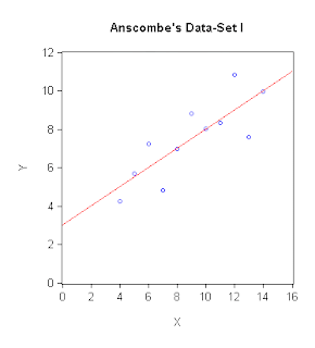
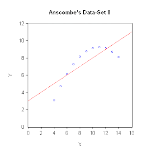

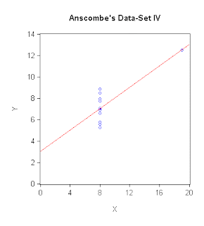
In each case, the means of X and Y are 9 and 7.5 respectively; the corresponding variances are 10 and 7.5; and the Pearson correlation coefficient between X and Y is 0.816. Accordingly, each OLS regression has an intercept of 3, a slope coefficient of 0.5, and an R2 of 0.666. You can see for yourself that while a linear OLS regression model is perfectly sensible for Data-Set I, this is obviously not the case for Anscombe's other three sets of data. Putting things differently, suppose I told you I'd a fitted OLS regression, taking the form:
Y = 3 + 0.5X + residual,
and I then asked you to draw the line and some "likely" associated data-points on a scatter-plot. I think that most of you would come up with something more like the plot for Anscombe's Data-Set I, than like the one for his Data-Set IV, don't you?
Incidentally, I'm told that Frank Anscombe never revealed just how he came up with these sets of data. If you think it`s an easy task to get all of the summary statistics and the regression results the same, then give it a try! Recently, Chatterjee and Firat (2007) showed how to use a genetic algorithm to generate data-sets with the same summary statistics but very different optics. If you're MATLAB-savvy you might like to try out their procedure to see what you can come up with.

Gives the term "spurious regression" a whole new meaning, doesn't it? To see how the graph was generated, and to check out the associated regression results, you can download an EViews file from the Code page that goes with this blog. In particular, take a look at the 'Read Me' text object inside the EViews file to get an idea of how you might use this material in an econometrics tutorial or lab. class. I tend to use it in two ways - first to make the point about plotting your data before you estimate a regression model; and second, to emphasize why the R2 associated with a fitted model is just about the last thing that I ever look at. Here, we have cross-section data, so the reported R2 of 0.491 is actually pretty respectable. In addition, the t-statistics for the estimated slope and intercept coefficients are7.9 and 5.4 respectively. On the face of it, we might be pretty happy with our fitted regression - at least, until we plot the data! I typically get students to estimate the OLS regression and then plot the data afterwards. People usually get the point!
I'm not sure that we really push this message hard enough in our introductory econometrics courses.The statisticians do better in this respect, and perhaps the most well-known example is "Anscombe's quartet" - a group of four very interesting data-sets produced by Anscombe (1973). The interesting thing about the four pairs of X and Y data is that they have identical summary statistics and the fitted OLS regression line is identical in each case. However, visually the data are dramatically different. The data and graphs are available in an Excel workbook that you can download from the Data page associated with this blog; and here are the scatter-plots with the fitted regression lines:


In each case, the means of X and Y are 9 and 7.5 respectively; the corresponding variances are 10 and 7.5; and the Pearson correlation coefficient between X and Y is 0.816. Accordingly, each OLS regression has an intercept of 3, a slope coefficient of 0.5, and an R2 of 0.666. You can see for yourself that while a linear OLS regression model is perfectly sensible for Data-Set I, this is obviously not the case for Anscombe's other three sets of data. Putting things differently, suppose I told you I'd a fitted OLS regression, taking the form:
Y = 3 + 0.5X + residual,
and I then asked you to draw the line and some "likely" associated data-points on a scatter-plot. I think that most of you would come up with something more like the plot for Anscombe's Data-Set I, than like the one for his Data-Set IV, don't you?
Incidentally, I'm told that Frank Anscombe never revealed just how he came up with these sets of data. If you think it`s an easy task to get all of the summary statistics and the regression results the same, then give it a try! Recently, Chatterjee and Firat (2007) showed how to use a genetic algorithm to generate data-sets with the same summary statistics but very different optics. If you're MATLAB-savvy you might like to try out their procedure to see what you can come up with.
I thought I should provide something new in this posting - some genuine value-added, if you like. So, I have two more sets of data and their associated "Curious Regressions" for your enlightenment. The data for these are available in a second Excel workbook on the Data page of this blog, and there is also a related EViews workfile on the Code page. Here's a plot of the first set of data, together with the OLS regression of Y on X:
 The R2 for the fitted regression is exactly zero - can you see why this would be the case? One interesting feature of this regression is that it provides an example where not only do the OLS residuals sum to zero (as they must, if the regression includes an intercept), but there are also equal numbers (20) of positive and negative residuals. In addition, you can see that the regression line passes exactly through 2 of the 42 sample observations. That is to say, the regression model "explains" 4.76% of the sample data exactly. Not a big percentage, I know, but why is the R2 zero?
Interestingly, if we took away all of the observations except for the two that the regression passes through, the R2 would still be zero, even though we'd then have a perfect "fit" to the data. You can easily check this yourself, using the EViews file or the Excel workbook. But weren't you taught that if all of the sample values are collinear, then R2 = 1? Hopefully, you've figured out what's going on here, and have recalled what R2 is actually measuring - namely, the proportion of variation in the sample values for Y that is explained by the regression model. The zero value for R2 arises in this case, quite correctly, because there is no variation in the Y "direction" as X changes. There is nothing for the model to "explain", and it succeeds admirably!.

Interestingly, if we took away all of the observations except for the two that the regression passes through, the R2 would still be zero, even though we'd then have a perfect "fit" to the data. You can easily check this yourself, using the EViews file or the Excel workbook. But weren't you taught that if all of the sample values are collinear, then R2 = 1? Hopefully, you've figured out what's going on here, and have recalled what R2 is actually measuring - namely, the proportion of variation in the sample values for Y that is explained by the regression model. The zero value for R2 arises in this case, quite correctly, because there is no variation in the Y "direction" as X changes. There is nothing for the model to "explain", and it succeeds admirably!.
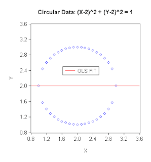
So, it's very important to recognize what R2 can, and can't, tell us. Once again, if I told you that I'd fitted a regression line:
Y = 2 + 0X + residual ; R2 = 0,
would you have guessed that the scatter-plot of the data is a circle?
Now let's add one more observation to the sample: a value corresponding to the point (X = 2, Y = 60). Obviously, this observation is a total outlier in the sample. Here's the corresponding scatter-plot and OLS regression line (with the outlier not shown, because I've deliberately kept the scales of the axes the same as they were in the previous chart).

A "robust" regression estimator would be much more appropriate here - right? For instance, we could use quantile regression, a special example of which is Least Absolute Deviations (LAD) regression. When we use LAD regression, the result is a fitted line just like the one in the first graph of the circular data. That's to say, the outlier is totally discounted - recognized for what it is, if you like. The LAD regression line is horizontal, with an intercept of 2.0. Can you guess what the median of the Y data is, with the outlier included? (By the way, what results would we have obtained if we'd used LAD regression before we added in the outlier observation?)
My final, example involves the data shown in the next scatter-plot:


So let's all be careful out there in regression-land, and I'll give the last word to the late John Tukey:
"The data may not contain the answer. The combination of some data and an aching desire for an answer does not ensure that a reasonable answer can be extracted from a given body of data."
Note: The links to the following references will be helpful only if your computer's IP address gives you access to the electronic versions of the publications in question. That's why a written References section is provided.
References
Anscombe, F. J. (1973). Graphs in statistical analysis. American Statistician, 27, 17-21.
Chatterjee, S. and A. Firat (2007). Generating data with identical statistics but dissimilar graphics: A follow up to the Anscombe dataset. American Statistician, 61, 248-254.
© 2011, David E. Giles
All you're saying is that it's best to have a theory before running a regression. The theory would have something to say about those "visual plots" that you recommend. I'm curious. Is this somewhat controversial among econometricians?
ReplyDeleteThanks a lot for these posts Dave! As someone who is practicing econometrics in the private sector now, I appreciate your well written and informative posts as quick reminders not to become complacent!
ReplyDeleteAnonymous 1: I don't think there are any serious econometricians out there who would find data-plotting at all controversial. Regrettably, there are lots of "empirical economists", and students, who haven't had these points drummed into them. I see some scary things that could have been avoided with a little graphical analysis. Thanks for you comment!
ReplyDeleteAnonymous 2: Thanks very much. I usually begin my first intro. grad. econometrics each Fall by telling the students that if I instill some skepticism, then I've done my job!
ReplyDeleteHow do you address the criticism that "peeking" at the data before building your model invalidates all your subsequent test statistics, because your model has been pre-adjusted to accommodate what might be random features? Do you just go all-out Bayesian?
ReplyDeleteAnonymous 3: Good question. Yep - I'd go all-out Bayesian, put a prior mass function on the model space, and go from there. In fact I'm a big fan of Bayesian model averaging.
ReplyDeleteThat seems like the best formal way to handle it, but I can't help feeling that your priors on finding messages written in the data are probably zero. Something funny is going on in such examples--you probably need to reason backward from the data to identify prior weights that would make your posteriors come to different conclusions, a la extreme bounds analysis.
ReplyDeleteAnonymous n. 1 here. Let me clarify: all this data-plotting is a metaphore for the quest for a theory. Is it controversial that we should have a theory before we do any data-work, data plotting included?
ReplyDeleteBTW thanks for your posts
Anonymous 1: Thanks for following this up. First, I don't think it's controversial that we need a theory first - I TOTALLY subscribe to that position. Having got that in place, my concern is simply that you see people then diving into the estimation of their model before "looking" at the sample characteristics of their data: be it structural breaks; outliers, etc.
ReplyDeleteTake a situation where we are using time-series data, for example, and we decide, correctly, to test for unit roots and cointegration. If structural breaks are present we need to modify our tests, or else we're likely to draw spurious inferences about the stationarity/non-stationarity/cointegration of our data. If that happened we'd move ahead with an invalid econometric specification of the model for estimatrion purposes. For instance, wwe might fail to use an error-correcion formulation and simply diference the data; or we might fail to difference certain variables. A theoretical model may suggest a relationship between Y and X1 and X2, say.
The theory will give us an interesting model to estimate and test, but it doesn't always tell us about functional form, for instance. Should the dependent variable be in levels or logs? Data-plotting may asist in such cases too.
Again, thanks for your interest in the postings!
How do you generate this type of data? I mean, data that display words when plotted.
ReplyDeleteJust good old-fashioned trial and error!
DeleteThanks for replying! Someone could write an algorithm for that. :)
Delete